
A fresher look for UniversitySite: preview
Preview · work in progress
UniversitySite is getting a visual update across all of its sites. Your pages and content stay where they are, and learners find them the same way. This page shows what changes for your learners first, then what changes for administrators and instructors, and then the new features that come with the update.
- Same menu items, in the same order
- Same pages in the same places, except that attorneys' CLE and CPD plans get a page of their own
- Same courses, plans and records
- Five new features, listed under New features below
For your learners · For administrators and instructors · New features
These screenshots come from a development build with sample data. The design is still being refined, so details will change before release. Some pages, including the LearningSite home page, are still being designed and aren't shown here.
For your learners
Learners reach every page the same way they do today, through the same menu items. Screenshots in your own guides will look different, and a few items in the top bar and the lists look different too. Each one still offers the same choices.
Today

Refreshed

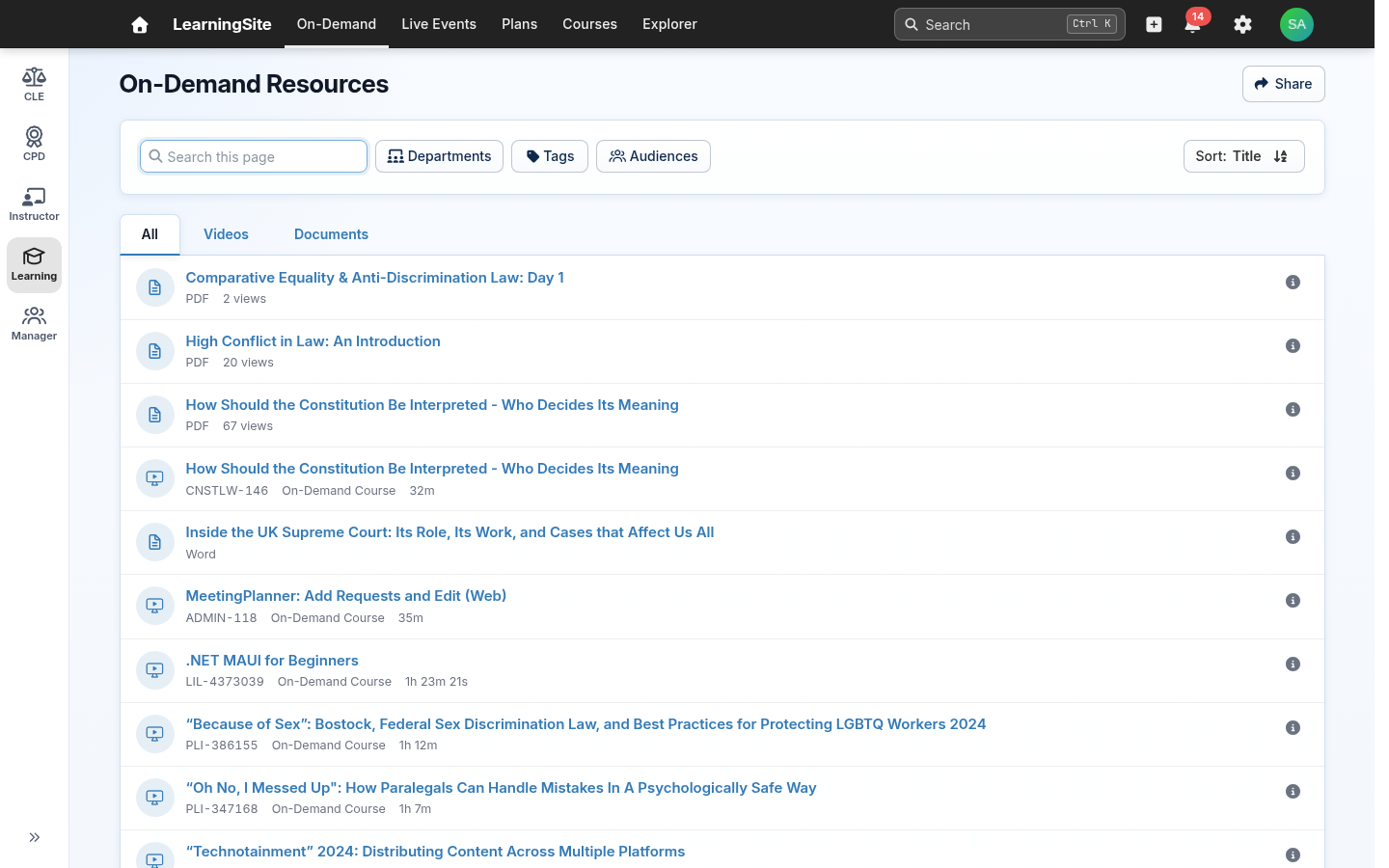
- Search moves into the top bar. It used to sit on its own row. Press Ctrl+K to jump to it. On smaller screens it shows as a magnifying-glass icon.
- The New menu becomes a + button. It has the same choices: Plan, Activity Record and Approval Request.
- The name menu becomes a badge with the learner's initials. It holds the same links, including Certificates, Settings, Contact us and Sign out.
- The to-do count moves onto a bell icon. It opens the same To-Do page.
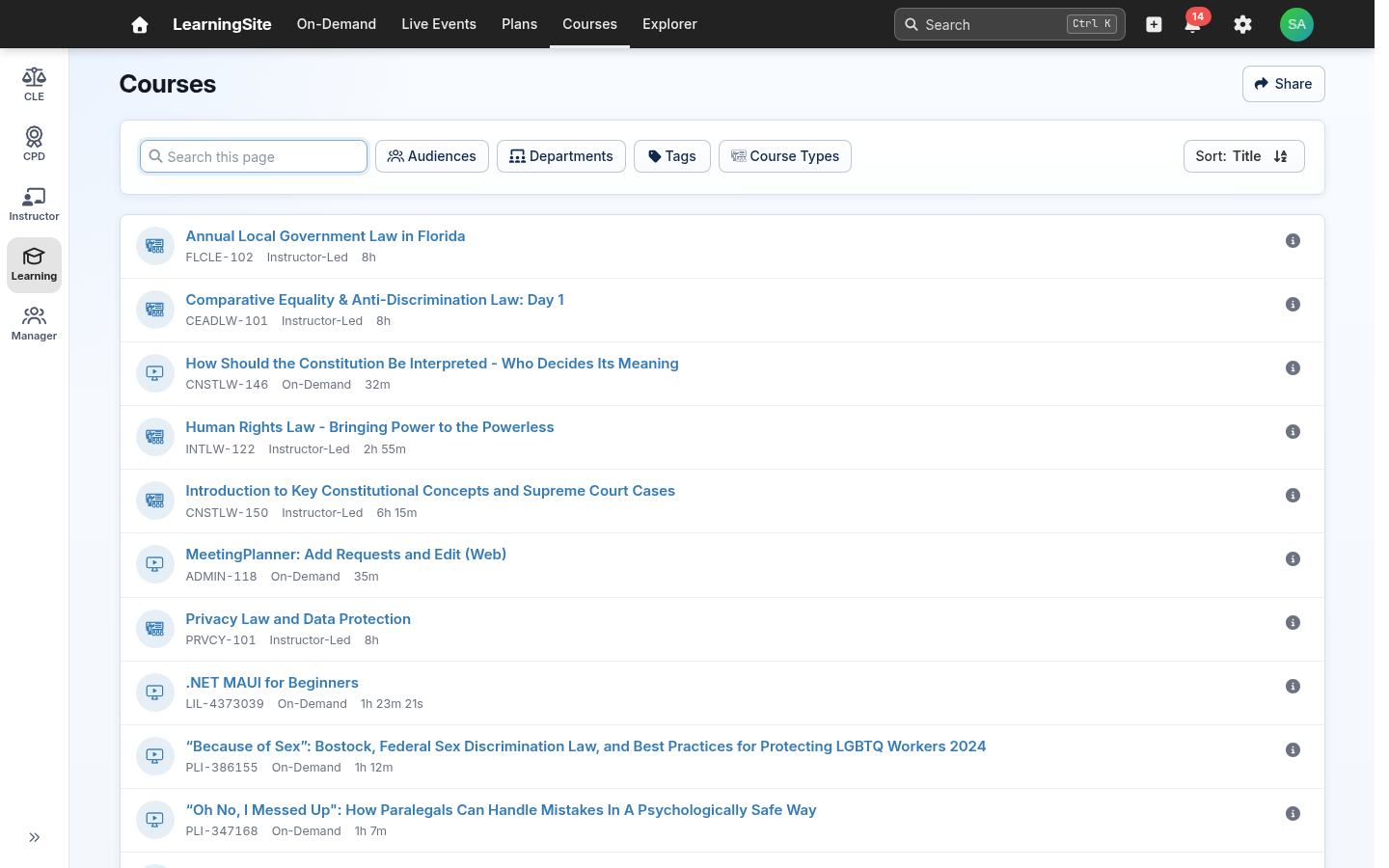
- Lists show one compact row per item. In the course and On-Demand lists, an item's details, including a course's description, open from the ⓘ button at the end of its row instead of showing under the title.
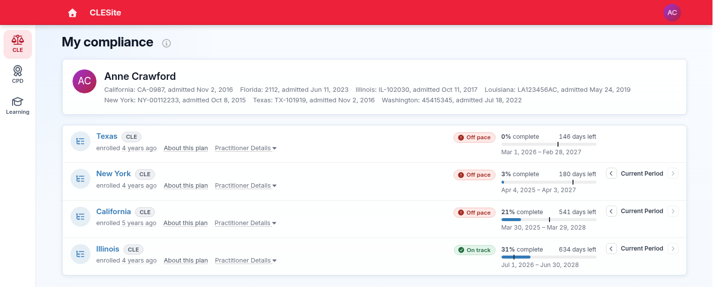
- CLE and CPD plans get a page of their own. The My CLE Plans tab on the Plans page (My CPD Plans or My CLE/CPD Plans on some sites) goes away. In its place, an attorney enrolled in an active CLE or CPD plan sees CLE (or CPD) in a column of app icons on the left of the screen. It opens My compliance: where they're admitted, and every plan they owe credit on, soonest deadline first. Their plans also stay under My Plans, and old links to the tab open My compliance.
The gear icon holds site settings for administrators. The new search results page is shown last below.
An attorney's My compliance page
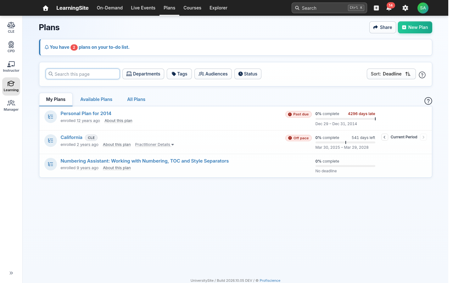
Your plans
Same page, new look. The same filters and plans. Each plan is now one compact row showing its progress, its time left and whether it's on pace, and About this plan opens its details. The My CLE Plans tab is gone: CLE and CPD plans stay under My Plans, and attorneys also see them on My compliance.
Today

Refreshed
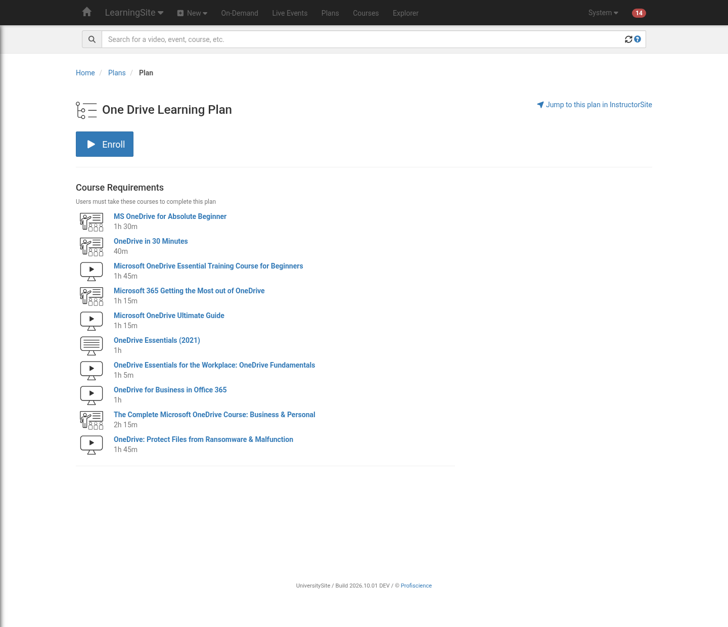
A plan, now with sections
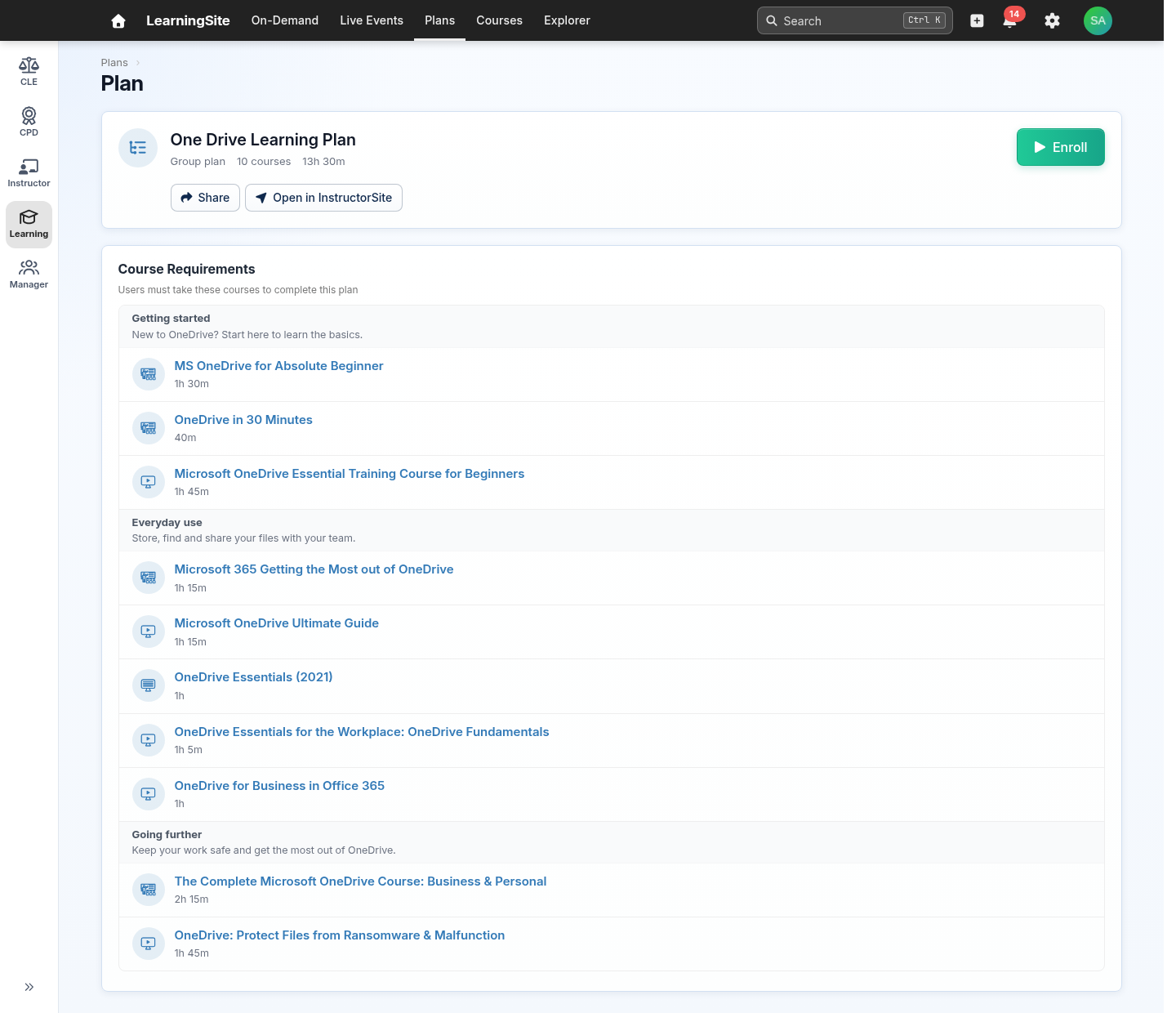
New feature: sections. The same courses and the same Enroll button, now in a card at the top with the plan's details, and now sections. Plan managers can group a plan's courses into named sections with a short description, and learners see those sections in the order the manager sets. A plan without sections shows its courses in one list, as it does today.
Today
Refreshed
The course list
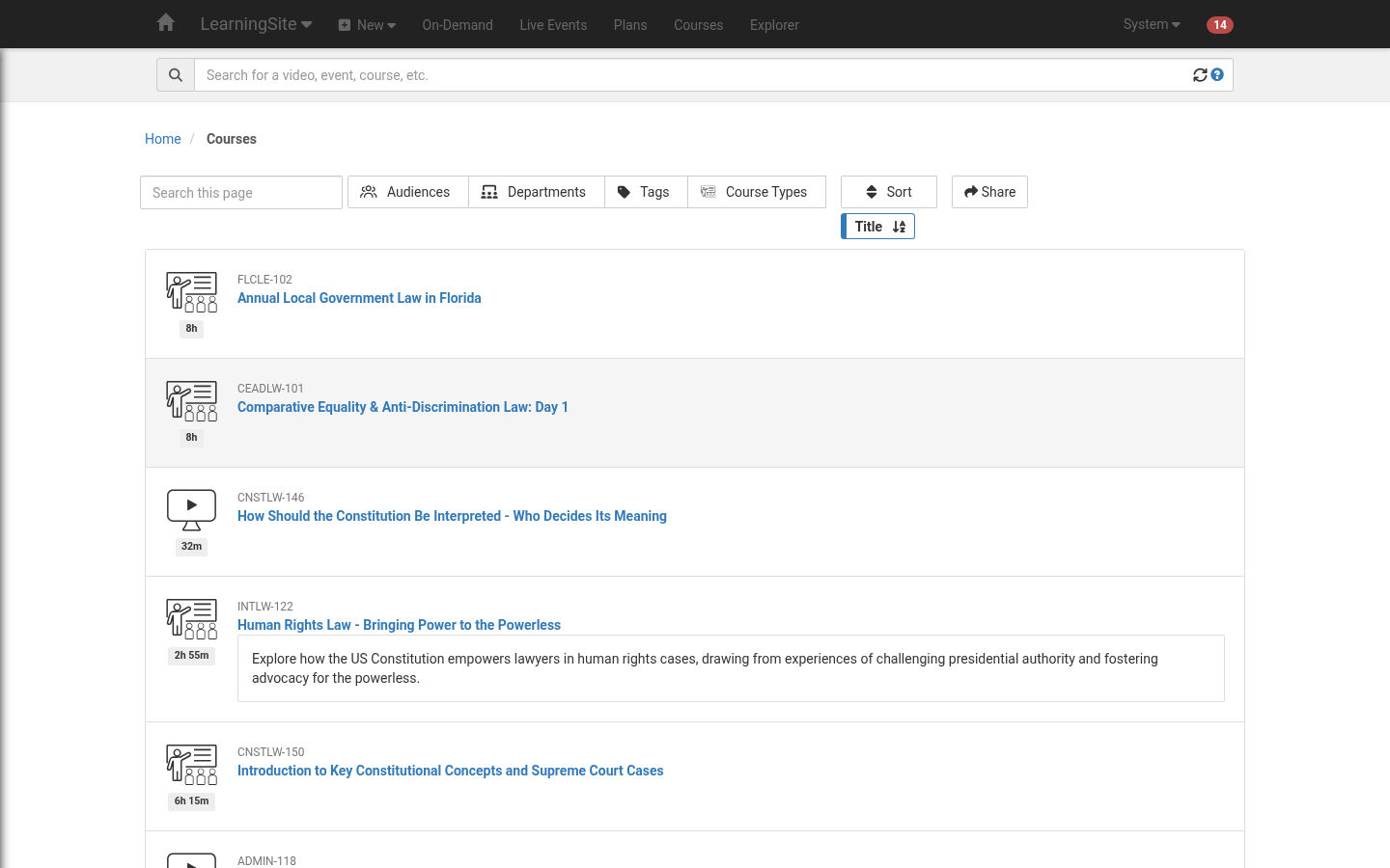
Same page, new look. The same courses, filters and sorting. Each course is now a compact row, with its code, type and length on one line, so more courses fit on the screen. A course's description now opens from the ⓘ button at the end of its row.
Today
Refreshed
A course page
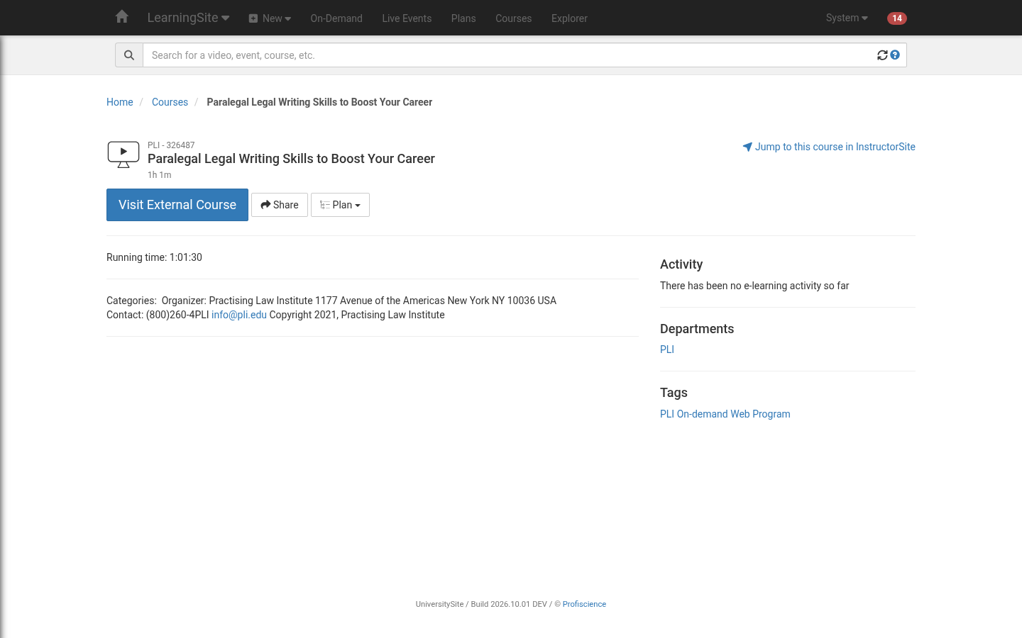
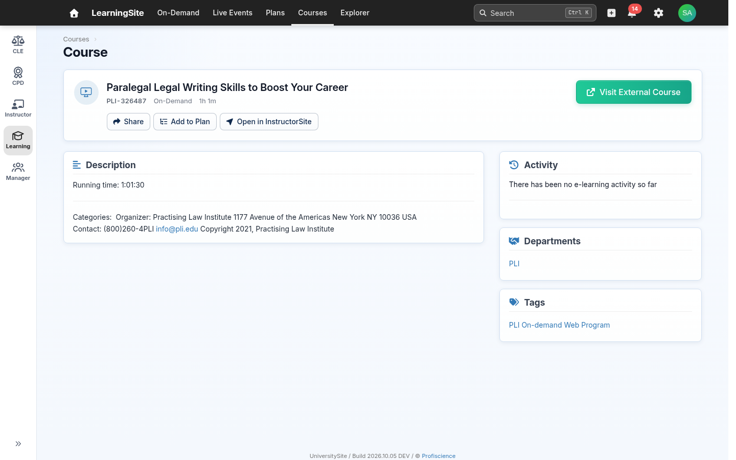
Same page, new look. The same buttons and details. The course's name, code and buttons now sit in a card at the top, and the description, activity, departments and tags sit in clearly labeled panels below it.
Today
Refreshed
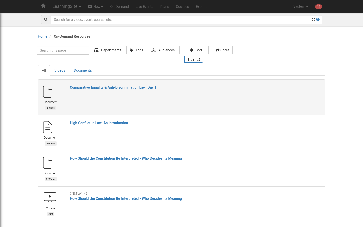
On-Demand resources
Same page, new look. The same videos and documents, with the same tabs and filters, in the same compact rows as the course list. Each item's details open from the ⓘ button here too.
Today
Refreshed
New feature: search results you can bookmark and share
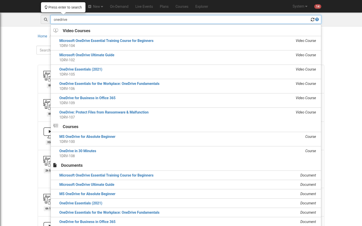
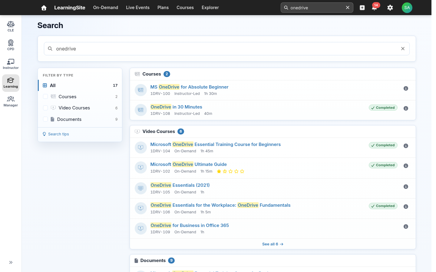
New feature: shareable search. This is another new feature, and a new page. You still search from the box at the top. Today your results appear in a drop-down list. In the refresh, press Enter and they open on a page of their own, grouped by type with filters on the left. The search is part of the page address, so you can bookmark a search or send the link to a colleague.
Today
Refreshed
For administrators and instructors
InstructorSite, ManagerSite, CLESite and CPDSite get the same fresher look. The menus and pages stay where they are. These are the changes most likely to affect your own work or your internal guides.
- A column of app icons down the left side. On a desktop, anyone who uses more than one site sees a narrow column of icons on the left edge of the screen: CLE, CPD, Instructor, Learning and Manager, as their access allows. One click switches sites and returns you to the page you last had open there. On a phone or a narrow window, the same list is in the menu. This replaces the drop-down on the site name at the top left, which now opens that site's home page. Learners who use only LearningSite don't see the column.
- Adding people to a plan. On a plan's Users tab, an Add enrollees button next to Refresh opens a picker. Type names, check each person's job, location and email, and enroll them. People already enrolled are marked. Advanced Search is still available from the picker. This replaces the New Enrollee button at the top of the plan page.
- A few labels are clearer. In reports and the event import, the event type "Both" is now "Hybrid", meaning events held in person and online. It finds the same events as before. A course that is both instructor-led and on-demand reads "Instructor-Led and On-Demand". A plan says how people get on it: "Learners can opt in", "Managers can assign" or "Plan-controlled".
- No more "All" choices in filters. Filters such as Location and Department no longer list "All Locations" or "All Departments". To see everything, clear the filter. Old links that used an "All" choice still work.
- Live Events. Dates and Calendar are two tabs at the top of the list, and All events or My events sits with the filters.
- A card at the top of each item's page. A course, plan, event or user page opens with one card that holds its main facts and its buttons. For a plan, that's Edit, Copy, Share and Delete. The rest of the page is below the card, as before.
- Lists show one compact row per item, in every site. That includes ManagerSite. Details open from the ⓘ button at the end of a row. When you select items, the actions for them and the count appear in the bar above the list.
- The same top bar in every site. Search sits in the bar (press Ctrl+K), New becomes a + button, the to-do count moves onto a bell, site settings are under the gear, and your name menu becomes your initials. Each site's search opens a results page of its own.
The column of app icons, opened to show each site's name
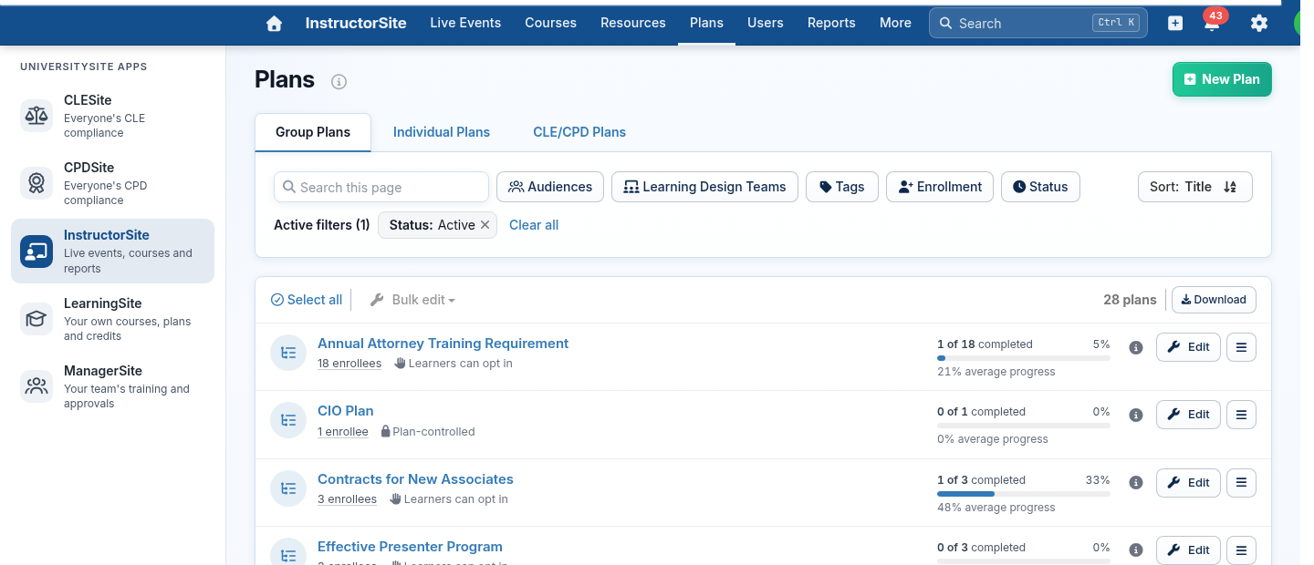
CLE and CPD. CLESite and CPDSite also become a place for CLE coordinators to follow compliance day to day, with each plan's progress across its enrollees and each person's admissions and plans. Attorneys get My compliance, described under For your learners. For the details, see CLESite and CPDSite in the refresh: preview.
New features
Five features come with the update. Two are shown in full below, and two more are in the learner screens above: sections in a plan, and search results you can bookmark and share.
- Sections in learning plans. Group a plan's courses into named sections. Shown below.
- Tracking of cancelled event registrations. Keep a cancelled registration, with its date and reason. Shown below.
- Search results you can bookmark and share. Shown last in the learner screens.
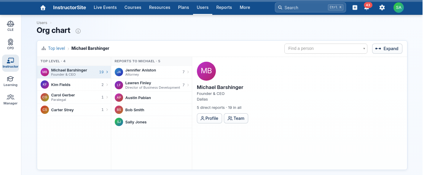
- An org chart. In InstructorSite, Users has an Org chart button that shows your firm's reporting structure. A person's page shows their reporting line, managers have a Team tab listing their reports, and you can filter the Users list by manager.
- Edit CLE and CPD plans in InstructorSite. Change a CLE or CPD plan's compliance settings without switching to CLESite or CPDSite.
The org chart in InstructorSite
New feature: organize a plan's courses into sections
This is one of five new features. Plan managers can group a plan's courses into named sections, each with a short description, and set the order of the sections. Learners see each section's name and description above its courses, so a long plan reads as clear steps.
- In the plan editor, add, name, describe, reorder and delete sections, and choose the section for each course.
- Deleting a section keeps its courses. They move to Other courses.
- Sections show on the learner's plan page and in the plan's progress views.
- Nothing changes until you add sections. A plan without them shows one list, as it does today.
In the InstructorSite plan editor
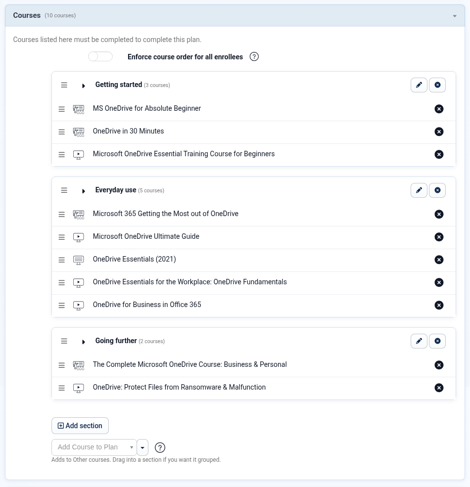
Plan managers build sections in the plan editor.
On LearningSite
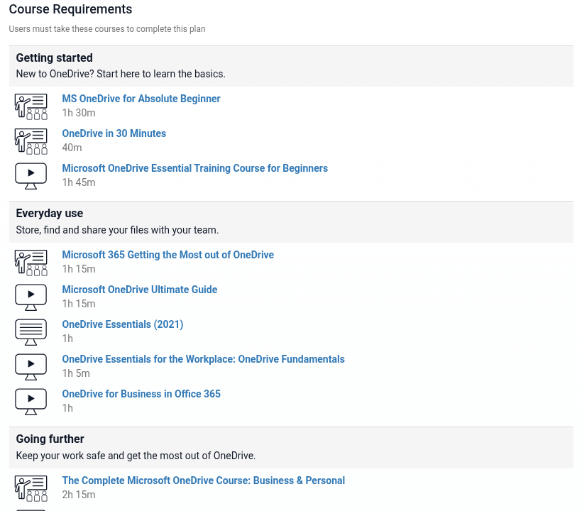
Learners see the same plan with its sections. The whole plan page, before and after, is further down.
New feature: track cancelled event registrations
When someone cancels a live event registration, UniversitySite keeps the registration and marks it cancelled, with the date it was cancelled and a reason, instead of removing it. You can see who cancelled, and when, rather than losing the record.
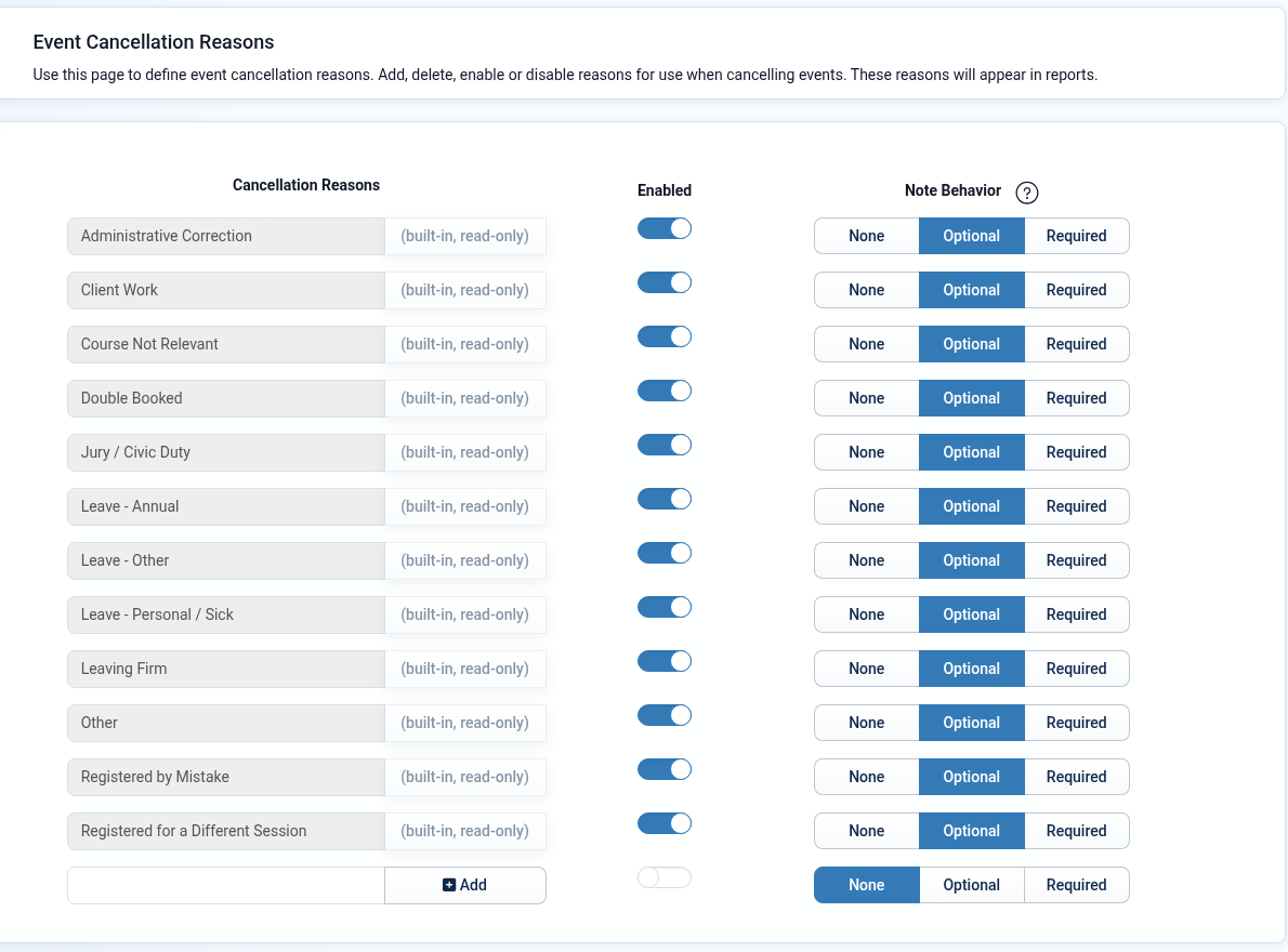
- It comes with a built-in list of cancellation reasons, each of which can be turned on or off. Administrators can add their own, and set whether each reason needs a note: none, optional or required.
- Instructors can cancel one registration or several at once, and can re-register someone who cancelled.
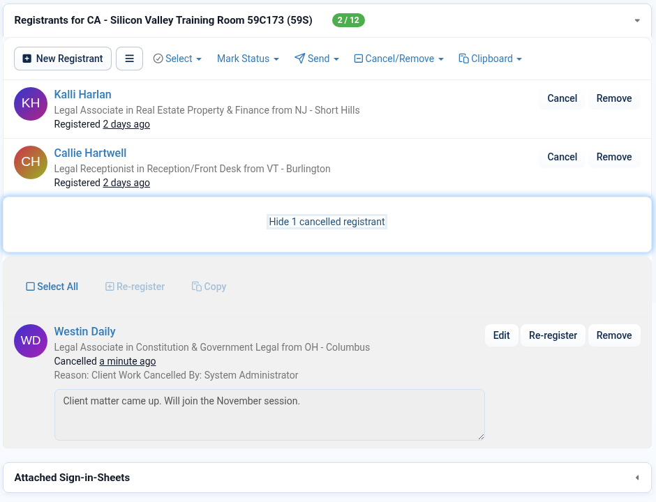
- Cancelled registrations show in their own section on the event, with the reason and note, and in the event reports.
This one is still being finished, so details may change.
Cancellation reasons, in InstructorSite
A cancelled registration on the event
Questions about the update? Reply on the UniversitySite Community, or email support@profiscience.com. We're glad to talk it through.
Screens shown with sample data. Updated October 5, 2026.